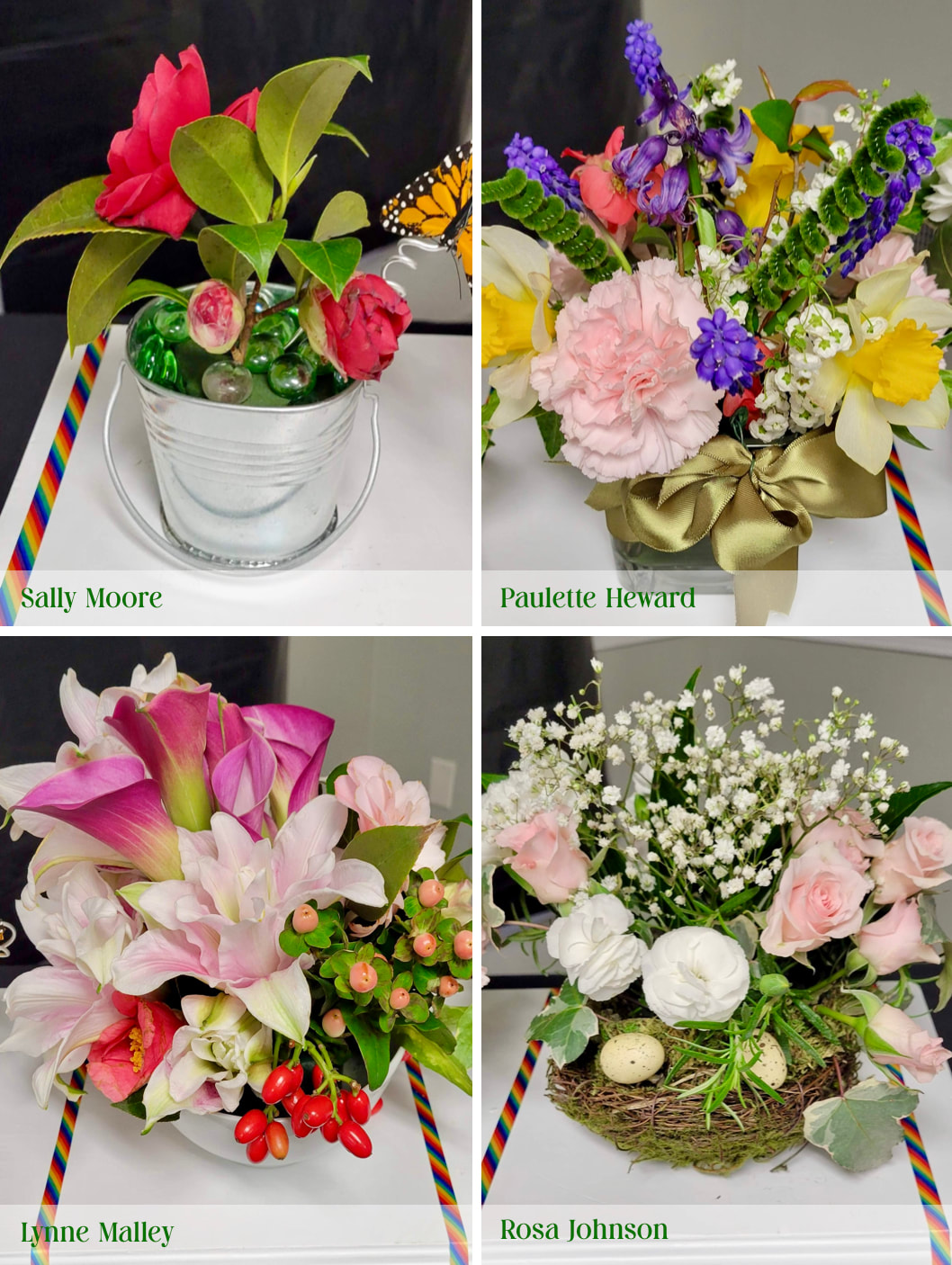
 Design Exhibit: Spring Has Sprung – Petite Design with freedom of style not to exceed 8" in width, depth, and height. Staged on a white elevated bookshelf provided by the Design coordinator.
Designers: Sally Moore, Paulette Heward, Lynne Malley, and Rosa Johnson 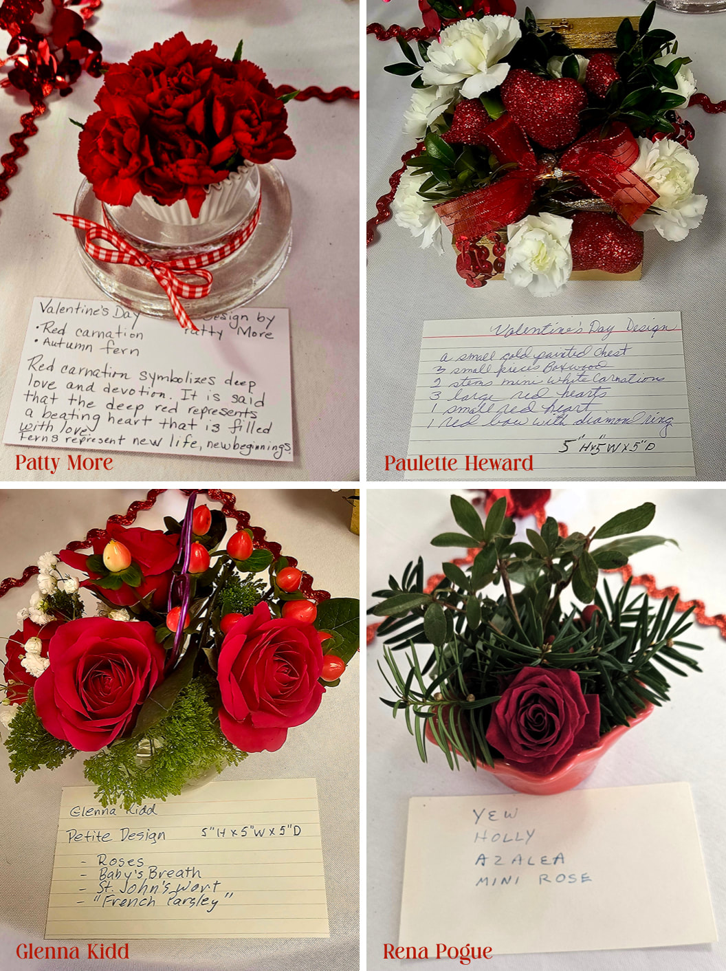 Design Exhibit: Valentine's Day – Petite Design with freedom of style not to exceed 5" in width, depth, and height. Staged on one-quarter of a white-draped elevated 76" round tabletop with red ribbon delineating space.
Designers: Patty More, Paulette Heward, Glenna Kidd, and Rena Pogue 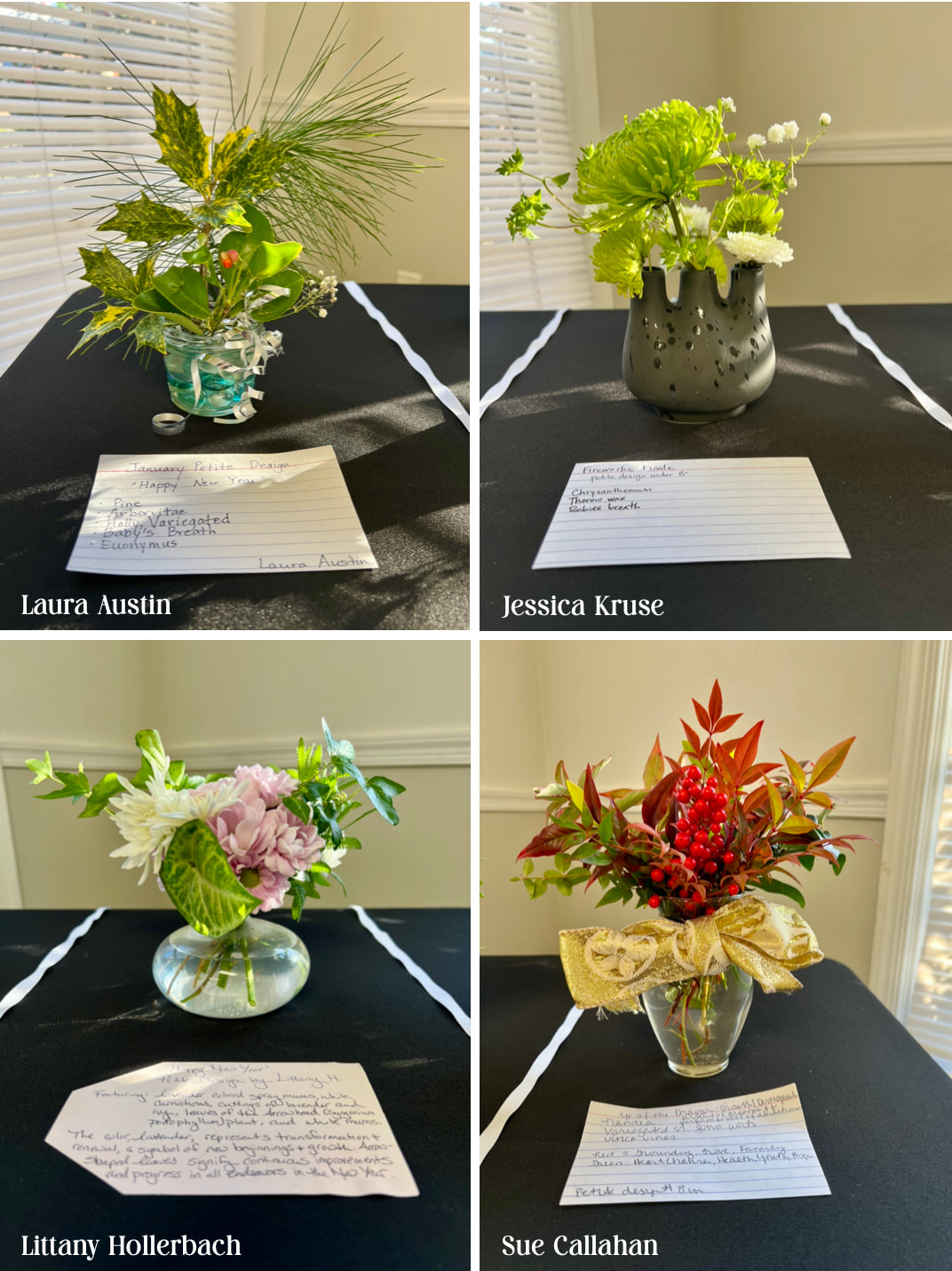 Design Exhibit: Happy New Year – Petite Design with freedom of style not to exceed 8" in width, depth, and height. Staged on a black-draped table.
Designers: Laura Austin, Jessica Kruse, Littany Hollerbach, and Sue Callahan 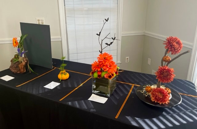 Design Exhibit: It's Halloween – Creative Line Design staged in a space that is 18" wide by 18" deep on a black-draped table. Exhibitor to provide staging panel and/or underlay if desired.
Designers: JoAnn Cook, Cathy Gallagher, Carol McNemar, and Paula Moratto Design Exhibit: Back to School – Design with freedom of choice of design style staged on a 45" high freestanding white pedestal with a 12" square top.
Designers: Sally Moore, Jane McClanahan, Cindy Hansen, and Diane Smith To view each design, click the play or arrow buttons located at the top of the photo. |
CATEGORIES
All
|